Rateview Redesign

OVERVIEW

ROLE

DAT is one of the leading shipping software companies in the world. Their SaaS suite includes their flagship product, Rateview. The Rateview web application provides up-to-date information to brokers and truckers in the shipping industry. Users quickly find average rates to ship particular types of loads between specific origins and destinations. The original product had aged poorly and didn't meet modern design standards. DAT needed Rateview updated with a new design and improved features on a new technical platform.
UX Designer
Research, Interaction, Visual design, Prototyping & Testing

Background

As UX Designer, I worked within an Agile team model, collaborating closely with the Product Owner, Project Manager, Business Analyst, and a team of developers, ushering the project through conceptualization, research, customer interviews, design finalization, and finally creating prototypes and working with developers as they implemented the design. I assisted our User Researcher with the testing, travelling to client's offices for user testing. I brainstormed with stakeholders, creating low fidelity wireframes and pixel perfect designs. The final product was built both to satisfy the very specific needs of the trucking industry, and strengthen DAT's branding strategy.

The Process

I work within a process based on Lean UX process and the Double Diamond Theory. My aim is to incorporate Discovery, Definition, Ideation and Implementation in all of my projects.

The Challenge

While the original Rateview product was well-received in the industry, features had been added to the product inconsistently and without an eye toward a coherent overall design. The application became slow, cluttered and difficult to navigate.


We used customer interviews and feedback in our product redesign, but also moved the application to a new technical platform and created a unified brand design to be used on all products across DAT going forward.

This redesigned product was intended to be more flexible, giving the best information to the user when they needed it. This was especially important with the information density our customers require.

Understanding the Problem

Building on what we learned from previous product launches, we developed a framework of potential improvements. We then traveled to several brokerages and conducted contextual inquiry research.

Our biggest discovery was that we needed more granularity in our concept of user types. We had already broken our user base into three distinctive buckets: shippers, carriers, and brokers (a third-party who manages shipper and carrier relationships.)

What we hadn't considered, until we interviewed a variety of clients, was each larger catagory was broken into two subsections: small businesses and large companies. The needs of a mom & pop shop differed significantly from a corporation's needs. The quickest method to map these differences was to generate personas. 
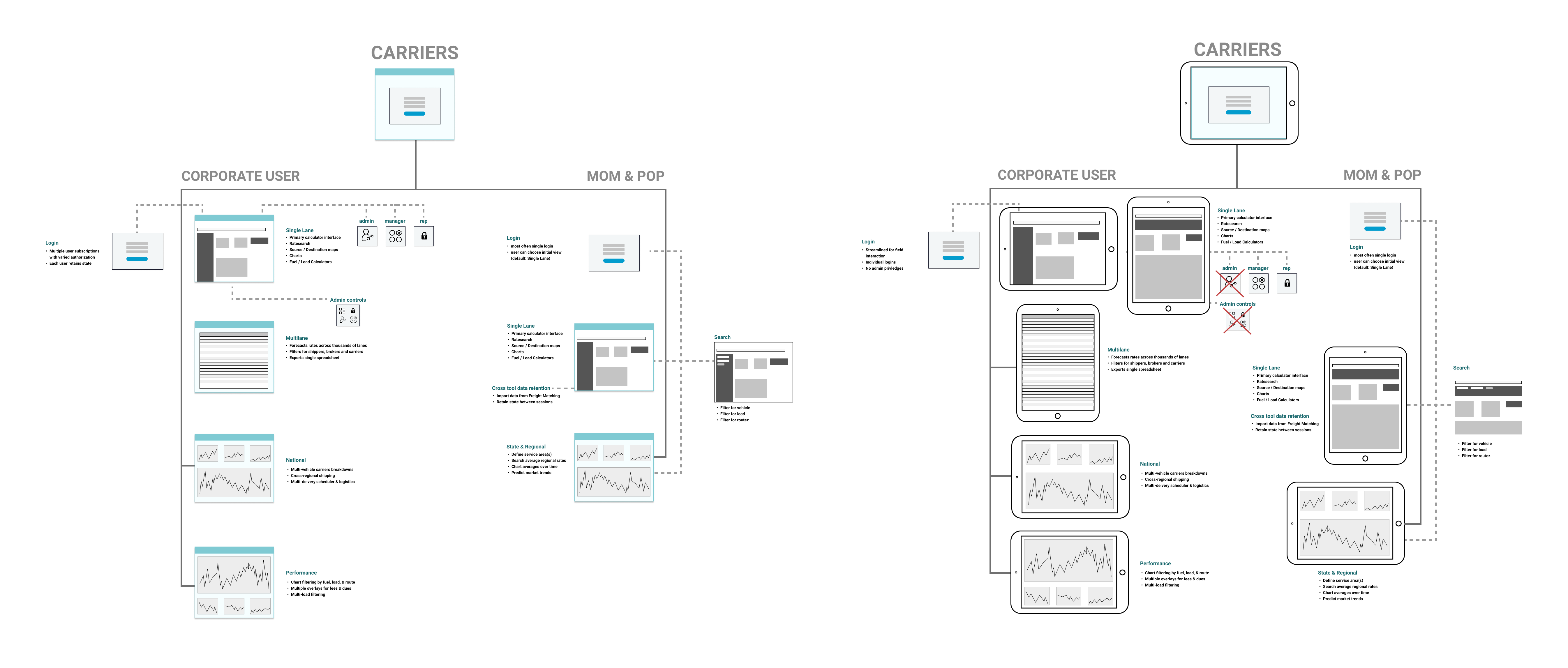
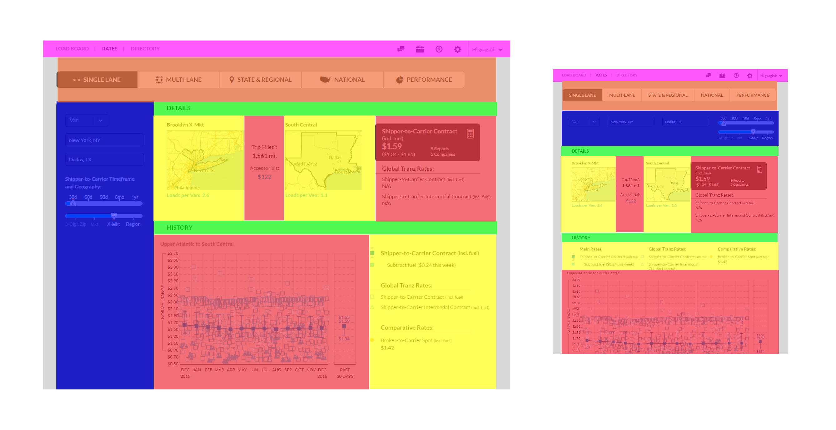
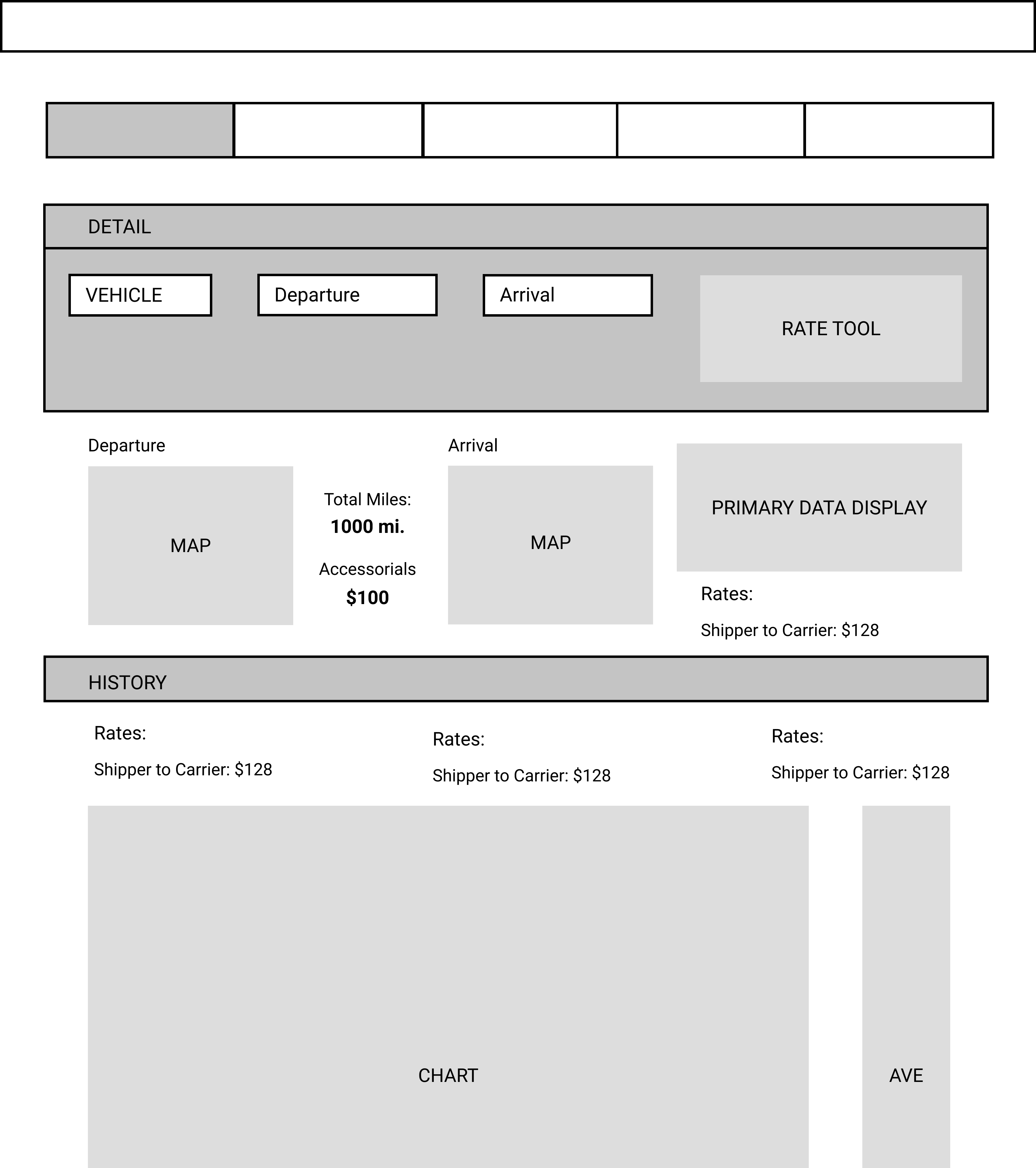
From there we studied the most common paths users folowed. Before the process of generating stories, I created user flows for each architype (and viewport) to clarify common user patterns and create the most efficient workflow.

Design Approach

The Rateview application didn't function in a vacuum, but worked with a suite of shipping tools. Unfortunately these tools were all created by third-party developers in a variety of incompatible design philosophies.

To keep Rateview and the other apps from falling into the same maintenance and improvement problems as their previous iterations, I advocated for DAT to implement a Design Pattern. I worked on the Design Pattern project in unison with the Rateview redesign.

The first step was to establish standards, beginning with a grid system.
Together, we established a 16 column, 8pt grid system with a modular design and responsiveness in mind.
All tools designed as flexible modules for easy rearrangement.
Tiles rearranged for smaller tablet screen size.

Wireframing the Solution

Based on our research and prioritization, we began presenting potential solutions to the team in these key areas of focus:
I quickly mocked up low-fidelity wireframes to educate and gather feedback from the Product Owner and Development on the layout and structure of the app. This involved establishing an institutional visual hierarchy and layout for all components. Lastly, I worked closely with the developement team as they implemented the design, solving issues and clarifying the design documentation.

Developing the Designs

Because this was before Figma and Sketch were in popular use, I created HTML, CSS, JavaScript mock-ups to educate stakeholders in the interaction patterns, particularly for custom elements that would not be intuitive to the average web user.

From these I gathered feedback from Frontend Developers, and tweaked the mockups until we had agreement about functionality and user interactions. Once we'd reached clarity, I provided HTML and CSS to be adapted by the Frontend Developers.

Throughout the development process I maintained UX reviews of each development story to ensure everything aligned with our new designs.

Outcomes

"This feels like home."

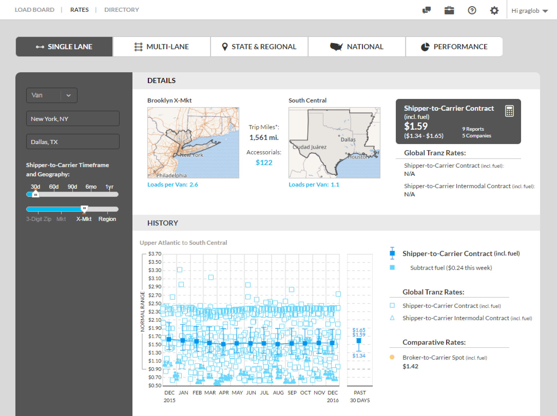
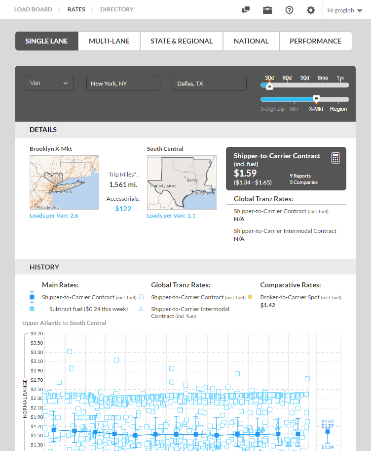
Our clients are ecstatic about the new design. We interviewed users after release and received extremely positive feedback.


"This shows me everything I need to know!"

I'm heartened to learn that as a team, we can make amazing changes to a design while improving the usability of the product. With careful consideration, we can chage the user's experience without alienating them. By responding to customer concerns about the current product while being respectful of what they like about it, we build customer loyalty.

Selected projects